Customer segmentation using clustering
This mini-project is based on this blog post by yhat.
Data
The dataset contains information on marketing newsletters/e-mail campaigns (e-mail offers sent to customers) and transaction level data from customers. The transactional data shows which offer customers responded to, and what the customer ended up buying. The data is presented as an Excel workbook containing two worksheets. Each worksheet contains a different dataset.
%matplotlib inline
import pandas as pd
import sklearn

import seaborn as sns
import warnings
from sklearn import cluster
import numpy as np
warnings.simplefilter('ignore')


from sklearn.datasets import make_blobs
from sklearn.cluster import KMeans
from sklearn.metrics import silhouette_samples, silhouette_score

import matplotlib.pyplot as plt
import matplotlib.cm as cm
import numpy as np

# Setup Seaborn
sns.set_style("whitegrid")
sns.set_context("poster")
Exploring the first data set:
The first dataset contains information about each offer such as the month it is in effect and several attributes about the wine that the offer refers to: the variety, minimum quantity, discount, country of origin and whether or not it is past peak.
df_offers = pd.read_excel("./WineKMC.xlsx", sheet_name=0)
df_offers.columns = ["offer_id", "campaign", "varietal", "min_qty", "discount", "origin", "past_peak"]
df_offers.head()
Console output (1/1):
.dataframe tbody tr th {
    vertical-align: top;
}

.dataframe thead th {
    text-align: right;
}
df_offers.info()
Console output (1/1):
<class 'pandas.core.frame.DataFrame'>
RangeIndex: 32 entries, 0 to 31
Data columns (total 7 columns):
 #   Column     Non-Null Count  Dtype
---  ------     --------------  -----
 0   offer_id   32 non-null     int64
 1   campaign   32 non-null     object
 2   varietal   32 non-null     object
 3   min_qty    32 non-null     int64
 4   discount   32 non-null     int64
 5   origin     32 non-null     object
 6   past_peak  32 non-null     bool
dtypes: bool(1), int64(3), object(3)
memory usage: 1.7+ KB
df_offers.describe()
Console output (1/1):
.dataframe tbody tr th {
    vertical-align: top;
}

.dataframe thead th {
    text-align: right;
}
The second dataset in the second worksheet contains transactional data – which offer each customer responded to.
df_transactions = pd.read_excel("./WineKMC.xlsx", sheet_name=1)
df_transactions.columns = ["customer_name", "offer_id"]
df_transactions['n'] = 1
df_transactions.head()
Console output (1/1):
.dataframe tbody tr th {
    vertical-align: top;
}

.dataframe thead th {
    text-align: right;
}
df_transactions.info()
Console output (1/1):
<class 'pandas.core.frame.DataFrame'>
RangeIndex: 324 entries, 0 to 323
Data columns (total 3 columns):
 #   Column         Non-Null Count  Dtype
---  ------         --------------  -----
 0   customer_name  324 non-null    object
 1   offer_id       324 non-null    int64
 2   n              324 non-null    int64
dtypes: int64(2), object(1)
memory usage: 7.7+ KB
df_transactions.describe()
Console output (1/1):
.dataframe tbody tr th {
    vertical-align: top;
}

.dataframe thead th {
    text-align: right;
}
Data wrangling
We’re trying to learn more about how our customers behave, so we can use their behavior (whether or not they purchased something based on an offer) as a way to group similar minded customers together. We can then study those groups to look for patterns and trends which can help us formulate future offers.
The first thing we need is a way to compare customers. To do this, we’re going to create a matrix that contains each customer and a 0/1 indicator for whether or not they responded to a given offer.
df = pd.merge(df_offers, df_transactions)
df_mat = df.pivot_table(index='customer_name', columns=['offer_id'], values='n', fill_value=0)

df_mat.head()
Console output (1/1):
.dataframe tbody tr th {
    vertical-align: top;
}

.dataframe thead th {
    text-align: right;
}
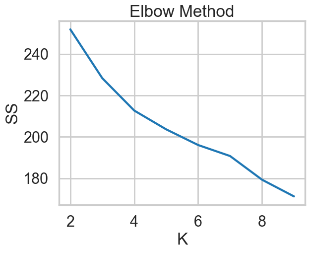
Initial clustering using KMeans
def generate_elbow_chart(data: tuple, k_range=range(2,11)) -> None:
"""
Plots 'SS' vs. 'K' so the user can pick an optimal 'K' based on the elbow sum-of-squares method
Parameters:
-----------
data (tuple) contains numerical values that will be used when fitting to the model
k_range (list) contains possible number of clusters
"""
ss = []
# perform for the given k-range
for k in k_range:
# get the clustering algorithm
kmeans = cluster.KMeans(n_clusters=k,
init='k-means++',
n_init=10,
max_iter=300,
tol=0.0001,
verbose=0,
random_state=None,
copy_x=True,
algorithm='auto')
# fit to the data
kmeans.fit(data)
ss.append(kmeans.inertia_)
# show the plot
plt.plot(k_range, ss)
plt.xlabel("K")
plt.ylabel("SS")
plt.title("Elbow Method")
plt.show()
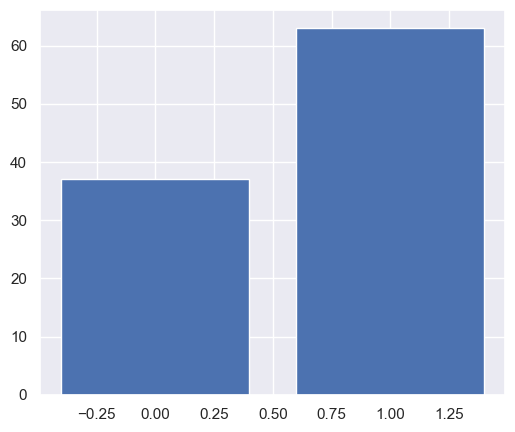
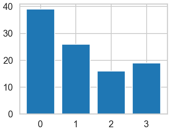
def generate_bar_chart(data: tuple, k: int, df_mat)-> pd.DataFrame:
"""
This function creates a bar chart showing the number of points in each cluster for k-means under the best 𝐾
"""
df_mat_2 = df_mat.copy()
# Set up cluster
kmeans = cluster.KMeans(n_clusters=k,
init='k-means++',
n_init=10,
max_iter=300,
tol=0.0001,
verbose=0,
random_state=42,
copy_x=True,
algorithm='auto')
# Fit the data and make prediction
pred = kmeans.fit_predict(data)
pred = pd.Series(pred)
bins = pred.value_counts(sort=False)
df_mat_2['cluster'] = pred.values
# Generate bar chart
plt.bar(bins.index, bins.values)
plt.show()
return df_mat_2
x_cols = np.array(df_mat.values)

generate_elbow_chart(x_cols, k_range=range(2, 10))
Console output (1/1):
k = 2
df_mat_2= generate_bar_chart(x_cols, k, df_mat)
Console output (1/1):
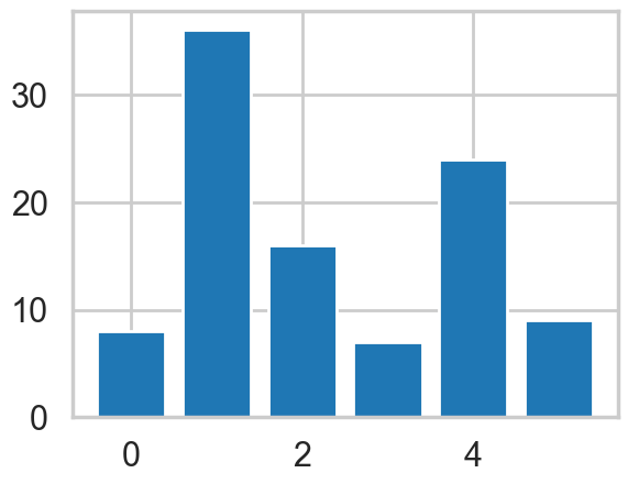
k = 4
df_mat_4 = generate_bar_chart(x_cols, k, df_mat)
Console output (1/1):
k = 6
df_mat_6 = generate_bar_chart(x_cols, k, df_mat)
Console output (1/1):
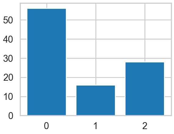
k = 3
df_mat_3 = generate_bar_chart(x_cols, k, df_mat)
Console output (1/1):
Visualizing Clusters using PCA
def generate_cluster_plot(df_mat_n):

    # Set up x and y variables
    df_mat_n['x'] = x_new[:, 0]
    df_mat_n['y'] = x_new[:, 1]

    df_final_n = pd.merge(df, df_mat_n.drop(columns=range(1,33)), on='customer_name')

    # Generate visualization
    sns.set(rc={"figure.figsize":(6, 5)})
    sns.scatterplot(x=df_final_n['x'], y=df_final_n['y'], hue=df_final_n['cluster'], s=80).set(title='Groups of Customers')
    plt.show()

# Initialize PCA
pca = sklearn.decomposition.PCA(n_components=2, svd_solver='auto', tol=0.01)
# Fit and transform the data
x_new = pca.fit_transform(x_cols)
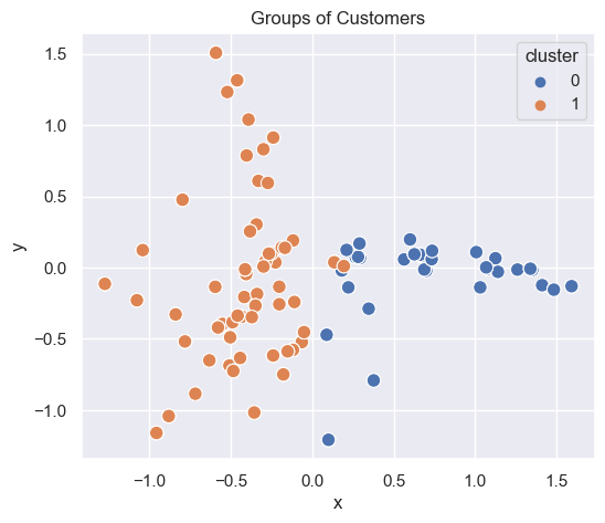
2 clusters
# Plot clusters
generate_cluster_plot(df_mat_2)
Console output (1/1):
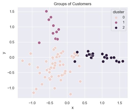
3 clusters
generate_cluster_plot(df_mat_3)
Console output (1/1):
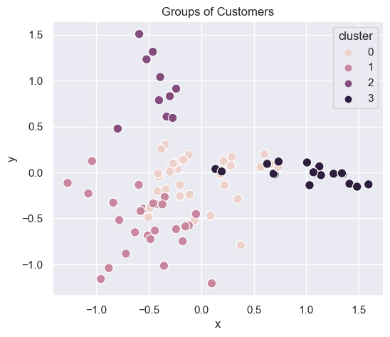
4 clusters
generate_cluster_plot(df_mat_4)
Console output (1/1):
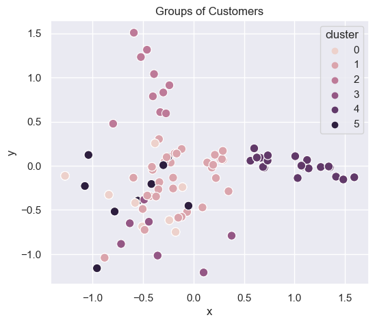
6 clusters
generate_cluster_plot(df_mat_6)
Console output (1/1):
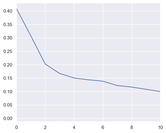
Choosing the optimal number of dimensions
import sklearn.decomposition
pca = sklearn.decomposition.PCA()
pca.fit(x_cols)

plt.plot(pca.explained_variance_)
plt.xlim([0,10])
plt.plot()
Console output (1/2):
[]
Console output (2/2):
Generating clusters with different methods
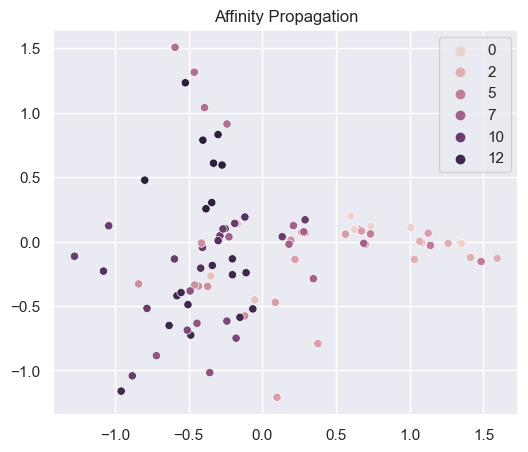
# 1. Affinity Propagation
def generate_clustering_4_methods(mat_df, n_clusters):
# Affinity propagation
afin = cluster.AffinityPropagation()
af = afin.fit_predict(x_cols)
sns.scatterplot(x=np.array(mat_df['x'].values),
y=np.array(mat_df['y'].values),
hue=np.array(af))
plt.title("Affinity Propagation")
plt.show()
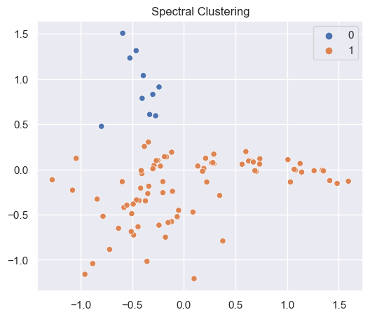
# Spectral clustering
sclus = cluster.SpectralClustering(n_clusters=n_clusters, assign_labels='discretize')
sc = sclus.fit_predict(x_cols)
sns.scatterplot(x=np.array(mat_df['x'].values),
y=np.array(mat_df['y'].values),
hue=np.array(sc))
plt.title("Spectral Clustering")
plt.show()
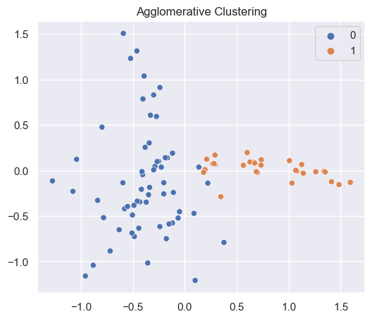
# Agglomerative clustering
aclus = cluster.AgglomerativeClustering(n_clusters=n_clusters)
ac = aclus.fit_predict(x_cols)
sns.scatterplot(x=np.array(mat_df['x'].values),
y=np.array(mat_df['y'].values),
hue=np.array(ac))
plt.title("Agglomerative Clustering")
plt.show()
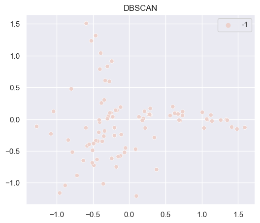
# DBSCAN
dbscan = cluster.DBSCAN()
ds = dbscan.fit_predict(x_cols)
sns.scatterplot(x=np.array(mat_df['x'].values),
y=np.array(mat_df['y'].values),
hue=np.array(ds))
plt.title("DBSCAN")
plt.show()
generate_clustering_4_methods(df_mat_2, 2)
Console output (1/4):
 Console output (2/4):
 Console output (3/4):
 Console output (4/4):